Case study
Design Systems
Two design systems, three years apart. The first I was tasked to draw from scratch in Figma, in light and dark, and it taught me what a system is and how it scales. The second I built alongside Claude as code, on a Flowbite base with the product's own custom Figma components, in a repo the developers share.
- Role
- Product Designer
- Years
- 2023 and 2026
- First system
- Figma component set, light and dark
- Second system
- Flowbite-based library as code, 295 components
- Tools
- Figma, Claude Design
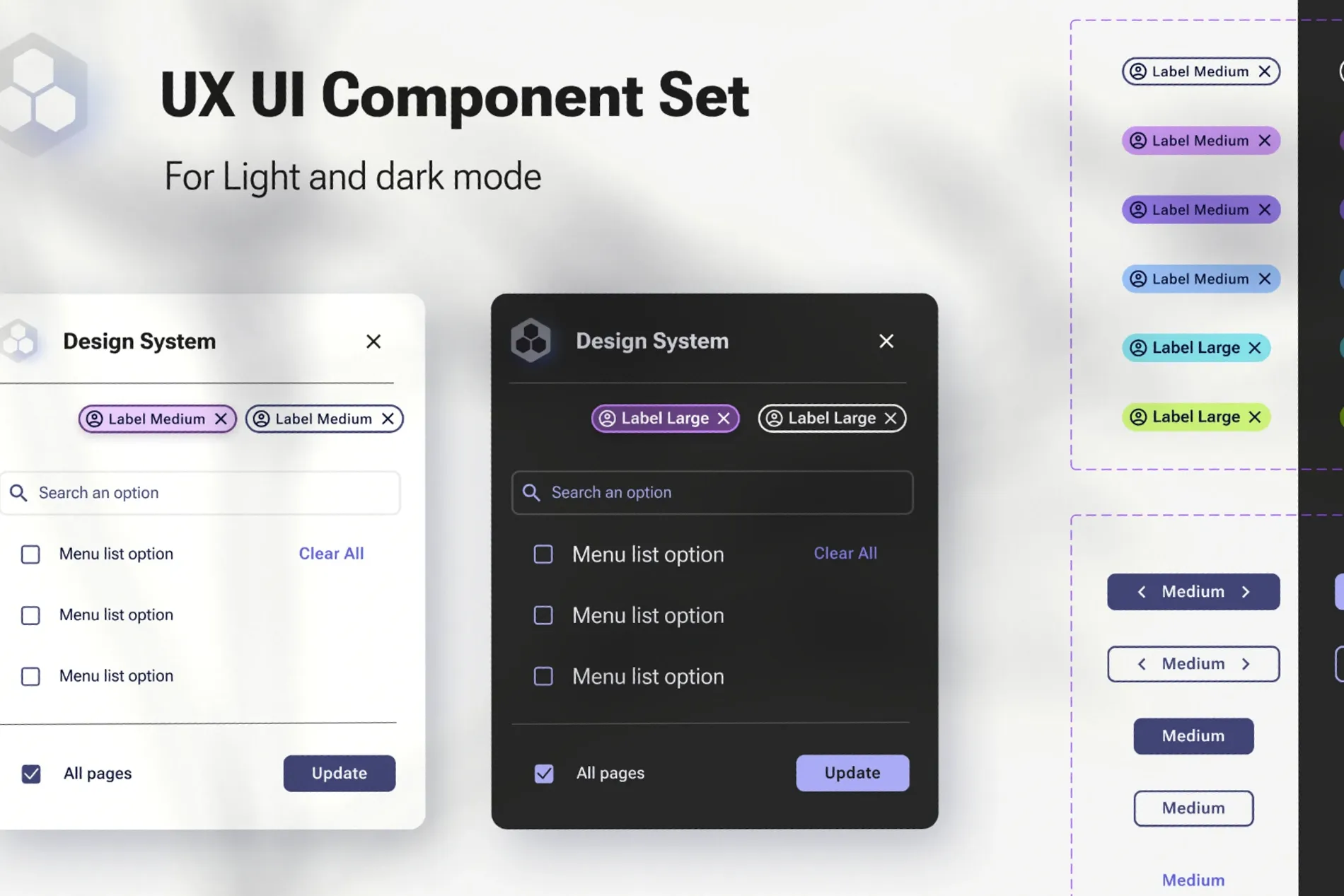
Two systems, three years apart
The first system was a task I was given in 2023: build the component set for the product, by hand, in Figma, with no library to start from. It was the project that taught me what a design system actually is and how each small decision has to hold up as the product grows. The second, in 2026, I built alongside Claude, taking the library that had grown in Figma on top of Flowbite, with our own custom components, and turning it into code that the developers and I work from together. What follows is what I did on each.
2023: from scratch, in both themes at once
Every token, component and state was drawn by hand in Figma. One lesson landed early: dark mode added after the fact is where systems come apart. Contrast that works on white stops working, borders disappear, and every component needs a second round of decisions nobody budgeted for. So every component in this set exists twice from the start. The multi-select menu, the chips, the search field, the checkbox list, the primary action: each drawn in light and dark side by side, and a variant only counted as finished when it held up in both.
The sheet keeps variant families inside labelled frames rather than listing components flat, so the whole colour range of a chip sits in one place and an outlier is obvious. A developer picking up a component gets every state it can be in, in both themes, in one view. Working this way, decision by decision, is what gave me a real appreciation for how much a system has to carry and why consistency at the token level matters once it scales.
A variant is not finished until it holds up in both themes.
2026: the product library, regenerated as code
The platform's library had grown in Figma out of Flowbite, a solid open source base, with a layer of custom components on top for what an operations product needs and a general kit does not: alarm severities and status pills, device tables with threshold cells, connectivity indicators, the side navigation with its Systems and Operational groups, filter bars, metric and donut cards. It worked for designers. Developers still had to read it and rebuild it, and every rebuild drifted a little.
I gave Claude Design the Figma file as the source of truth and the product's own front end as the code reference, and had it generate the system as a repository: 295 React components with their types and demo cards, 373 tokens, Inter self-hosted in three optical sizes, and a readme that states the rules. Where code and Figma disagreed, Figma won, so the palette, type and semantics follow the design rather than the code's earlier values. Then I worked it like a product: patching the Systems colour palette, rewriting the side navigation to behave like the one in Claude's own app with tooltips on hover and expansion on click, and fixing what the adherence checks caught.
The repo is shared with the developers. They pull the same tokens and components I design with, so a change to a colour, a radius or a hover timing is a commit they receive rather than a redline they interpret. Handover became a pull request.
The design system stopped being a picture of the product and became part of it.
IoT/Button2
IoT/FixedTabs
IoT/Toggle · Checkbox · RadioButton
filter-chip
.iotnxt-input
What carried over
- Both themes, always. The 2023 rule became a token rule in 2026: colour lives in the components, so light and dark are one switch.
- Every state, in one view. The variant frames of the sheet became demo cards in the repo, one per concept, forty-three of them.
- Custom where it earns it. Flowbite for buttons, inputs, menus and modals. Custom for the parts that make it an operations platform.