Case study
Nexa AI
Operators work inside a telemetry workspace and needed to understand and act on what it shows without leaving it. Nexa is the platform's in-product AI assistant: a chat panel beside the screen an operator is working in, aware of what is on it, plus the admin screens that decide who may use it, how much, and with which model.
- Role
- Product Designer
- Year
- 2026
- Surface
- Operations web app
- Tools
- Figma, Claude Design
- Scope
- Chat experience, states, admin screens
The need
Operators spend their day in a telemetry workspace: dashboards, alarm lists and reports for the sites they look after. The need was straightforward. They wanted to ask questions of that data while looking at it. What does this reading mean, how does it compare with last week, what should I do next. The AI had to work in context, with the telemetry in view, rather than in a separate tool that could not see the screen.
A chat panel is the natural fit for that, so the design work went into how it behaves in an operations setting. It docks beside the operational page and resizes by drag, so it can sit as a narrow column next to a dashboard on one monitor, or open wide on a dual screen setup where the conversation takes one display and the telemetry keeps the other. When it is closed it collapses to a small floating icon the operator can place wherever it does not get in the way. The panel, the entry point and the states around them were the brief, not the idea of a chat assistant itself.
Ask about the data while you are looking at it.
Where it sits in the platform
The platform follows a multi-layered architecture, structured across four primary dimensions. Two of them frame this project. The System layer captures telemetry and defines how it is managed: user permissions, asset management, alarm configuration. It is the backbone, and much of it is structured as guided workflows. The Operations layer is where that telemetry is presented to people, and the lens it is viewed through: alarms, dashboards, reporting. It is where monitoring, analysis and interaction happen.
Nexa is the platform's in-product AI assistant, and it runs across both. Under the surface a supervisor agent reads what the user means and routes it to specialist agents, a diagnostics expert, an operations specialist, and returns one unified answer. On the Operations side that means contextual questions about whatever is on screen, a dashboard, a report, an alarm list, help determining the next step, and additional customer reporting from the data in view. On the System side it has its own screens for who may use it, how much, and with which model. My brief was the surface: the chat panel and its behaviour, its states, and the conversational layer, the onboarding message that sets what the assistant can do and the context-aware starter prompts that open each session.
The chat experience
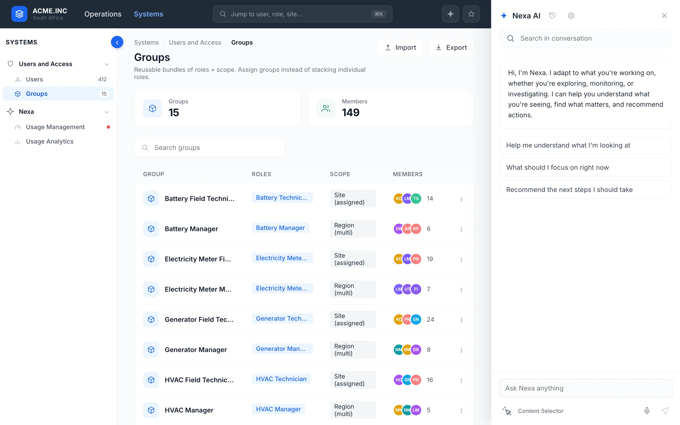
A launcher and a right-side panel that persists while the operator stays on their operational page. It docks beside the screen rather than covering it and resizes by drag, so it fits split screen and dual screen setups instead of assuming one window size. Nexa knows the page and the active filters, so the three starting prompts are always about what is in front of the operator, and the panel shows which site and filters it is reasoning over.
The content selector is the part I am proudest of. Instead of describing a table or a card in words, the operator switches the selector on, points at the element, and it becomes the subject of the conversation. A value like oil pressure can be pulled into the thread and acted on in place, with the dashboard still visible next to it.
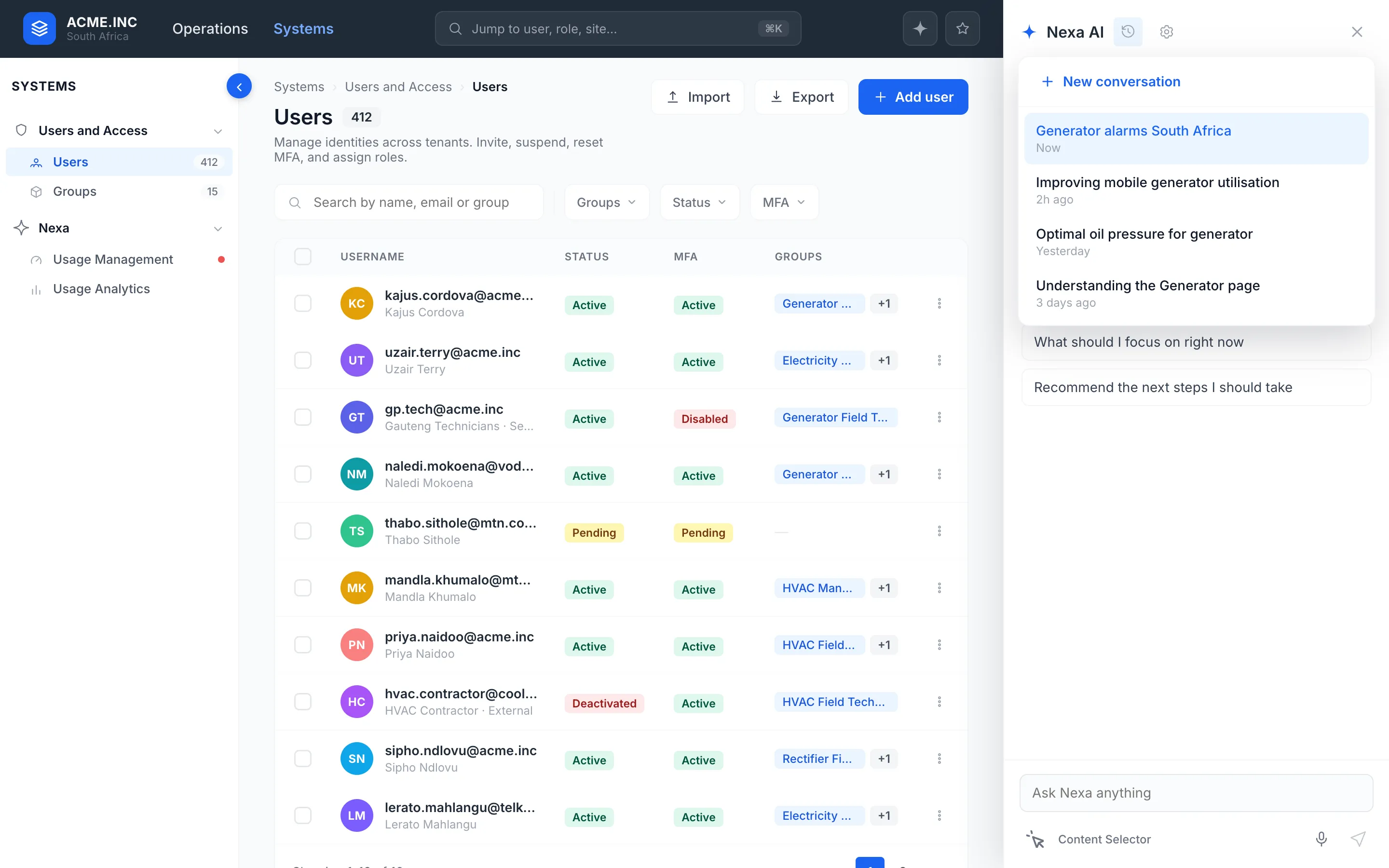
Conversation management is in scope, not a nice-to-have. Threads can be created, switched, renamed and deleted from a recent list. Search works inside a chat. Every answer can be copied and rated with a thumb, which feeds the model back. Conversations persist, and the assistant carries short-term and long-term memory across them.
What I designed
- The launcher and panel. Docked, persistent on the operational page, resizable by drag, with its full set of states from first prompt to a long conversation.
- Screen-context awareness. Indicators for the page and filters Nexa is using, and the content selector to focus it on any element on screen.
- Thread management. Create, switch, rename, delete, a recent list, in-chat search, copy and thumbs feedback.
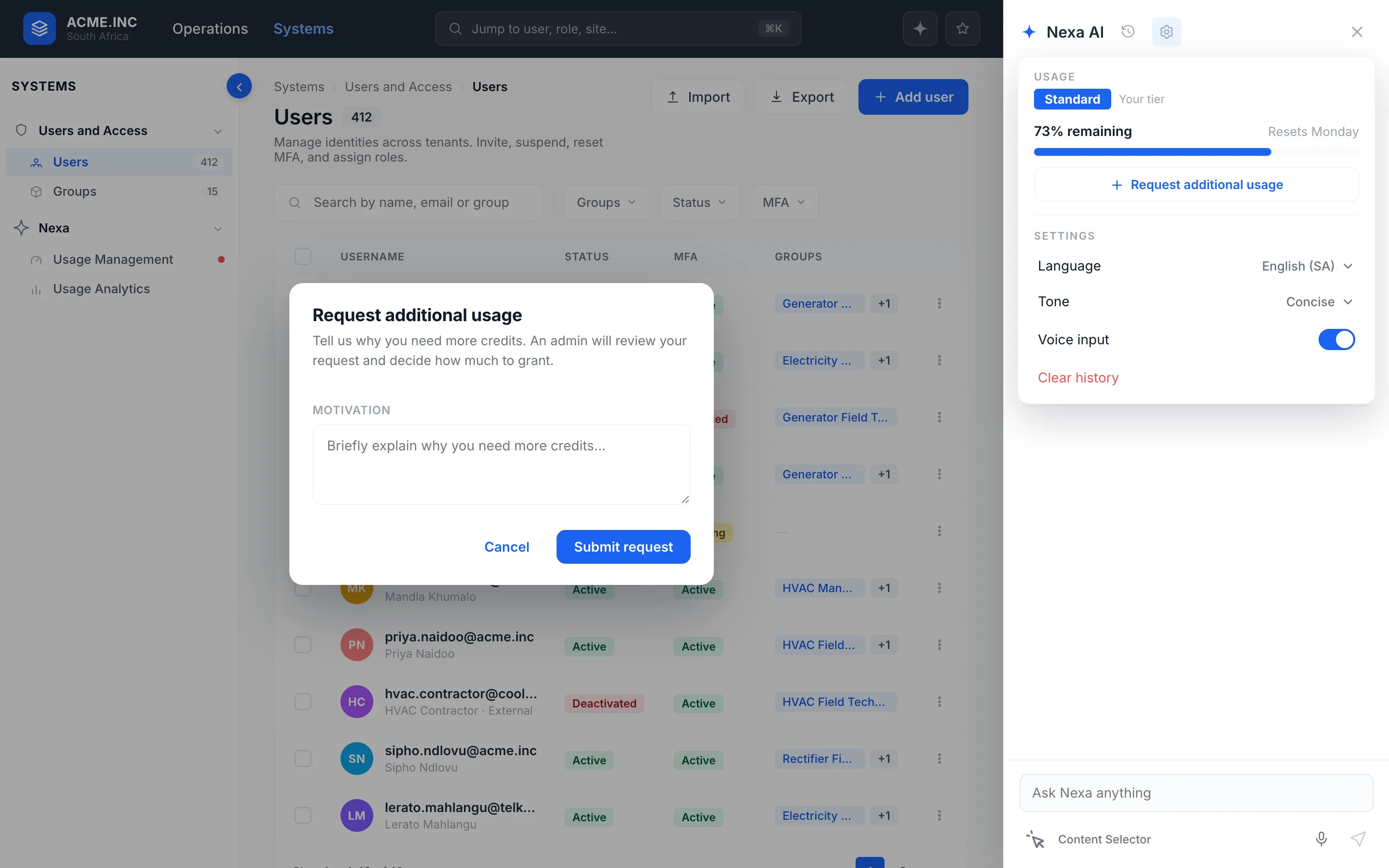
- Limitation and confirmation states. Missing-context prompts, unavailable messages, module and role gating, and the proposed action, confirm, result pattern.
- The scored insight. Score, factor breakdown, confidence, reasons and trend, with a not-assessed variant, for health, risk and anomaly surfaces and for inline rendering in chat.
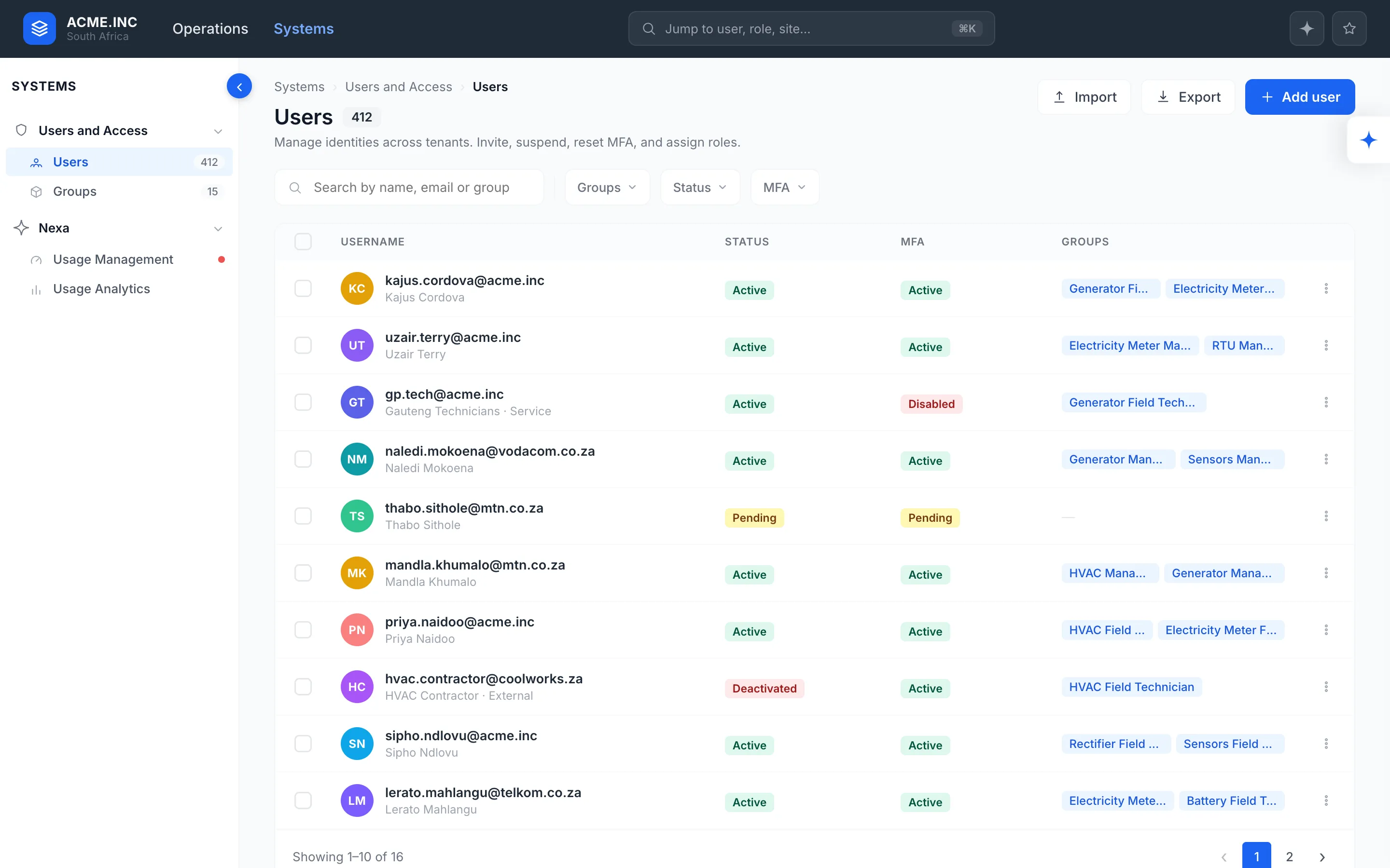
- The movable entry point. A floating button the operator can place anywhere, after testing showed a fixed one in the way.
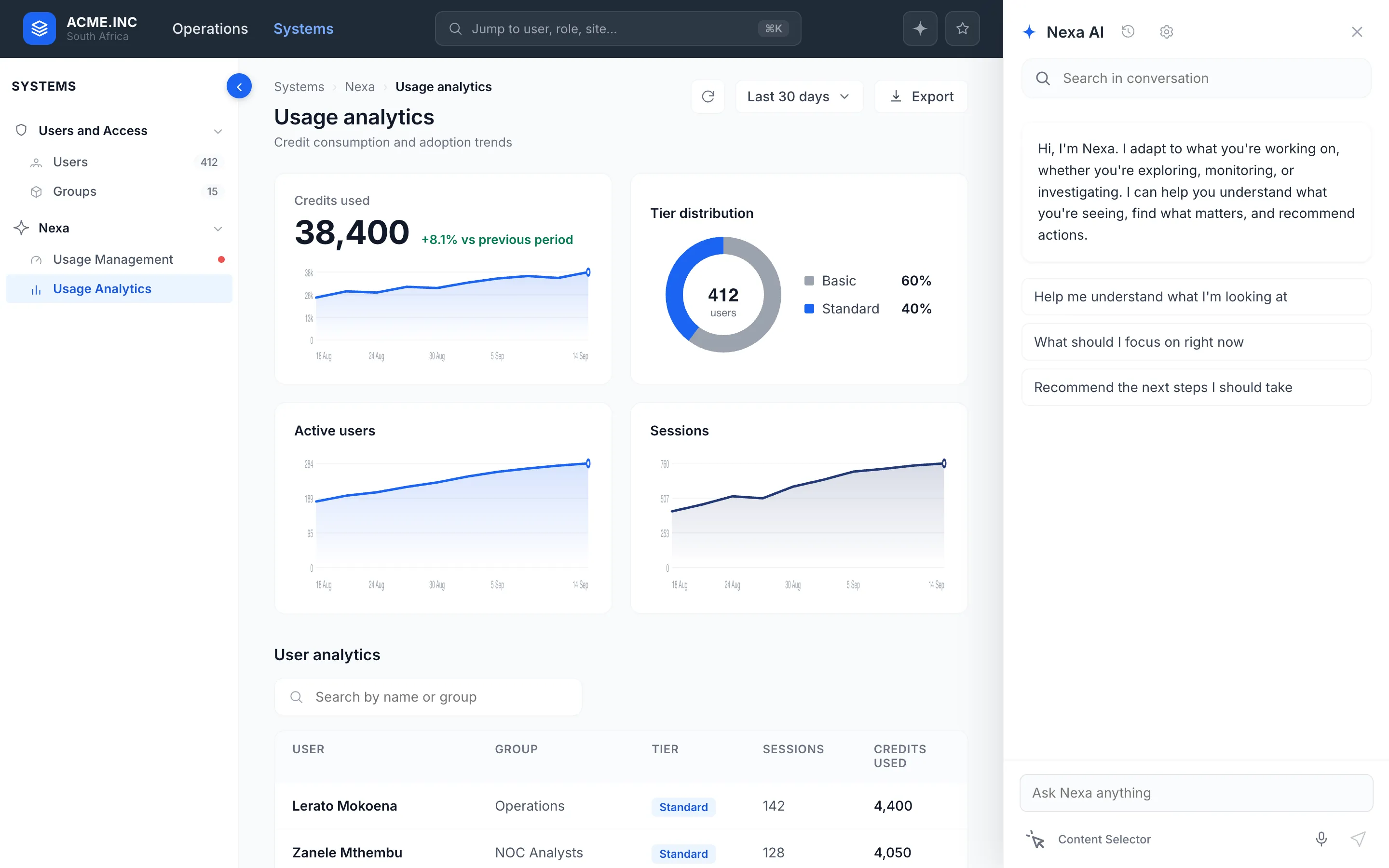
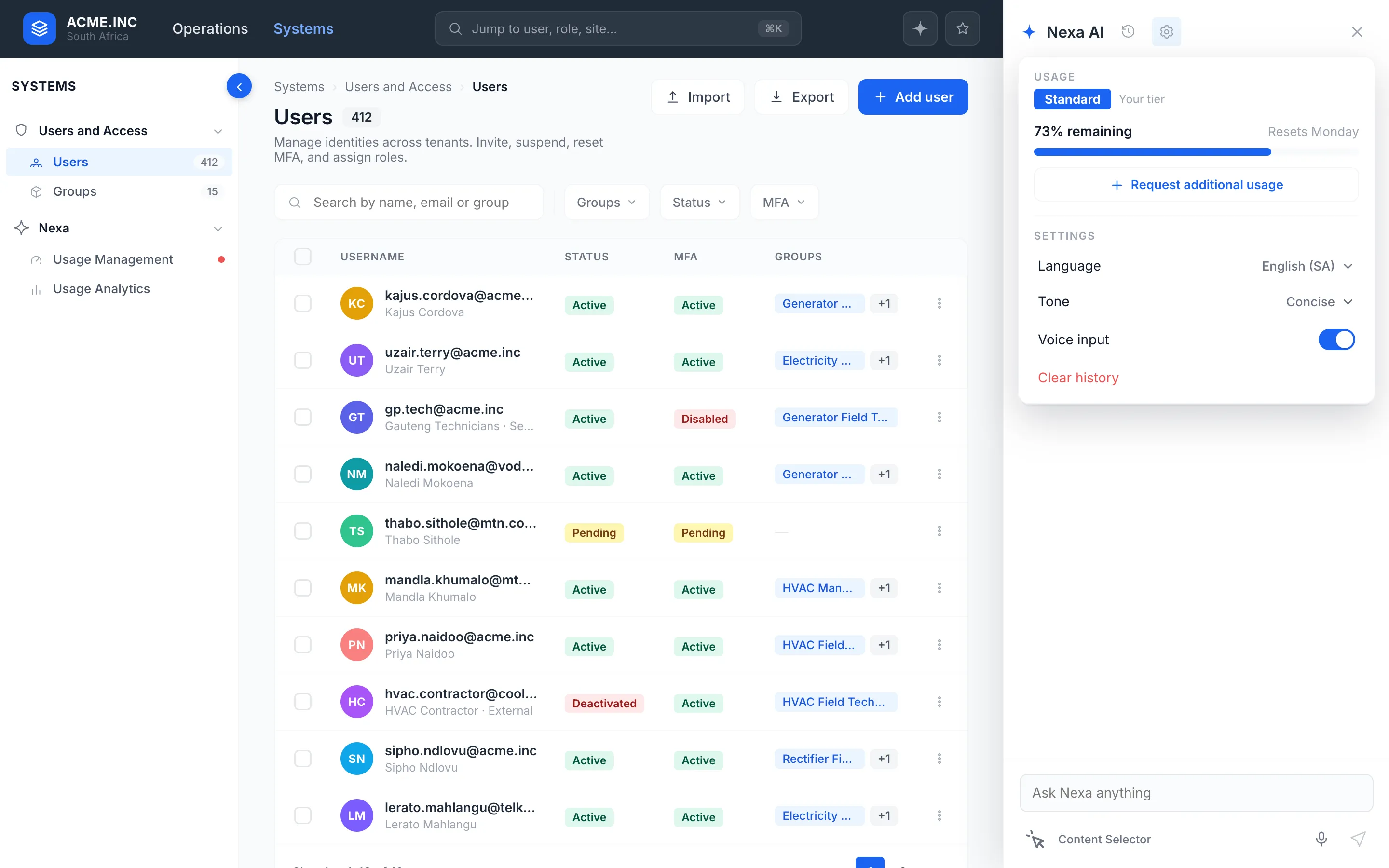
- User management and groups. Admin screens to invite, suspend and assign people, and to bundle roles and scope into groups, with analytics by user and group.
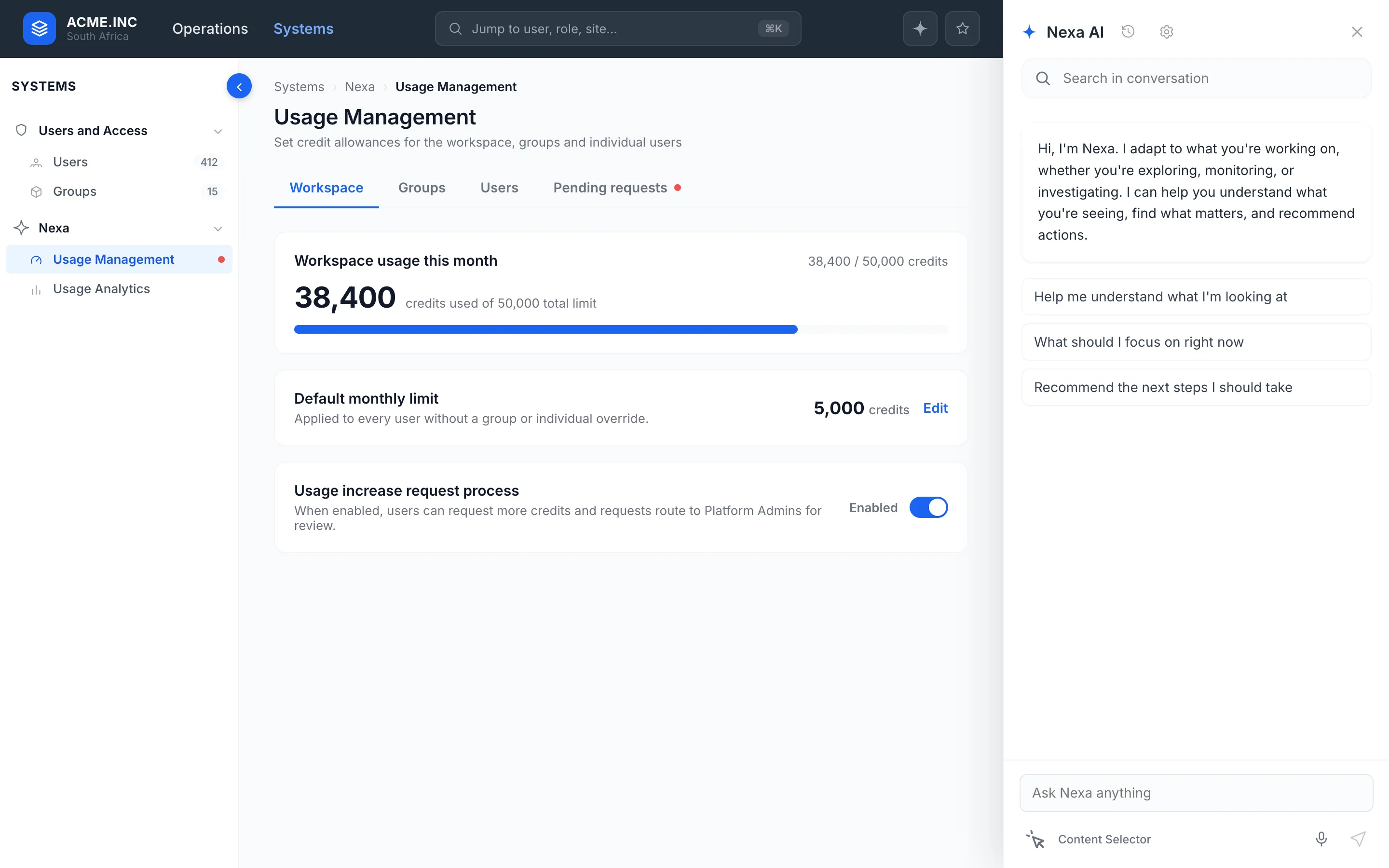
- Usage, tiers and models. A workspace limit, a default per user, overrides, a request process, and a swap between the Default and Gold models gated by tier.
What testing changed
Testing with operators changed the entry point. The trigger had been docked in a fixed position, and on the filters tab it sat over the Apply button. People were working around the very thing meant to help them. It became a floating button the operator can move, so they decide where it sits rather than the design deciding for them.
That is the part worth keeping from this project. The panel concept survived testing intact. The way people reached it did not, and it was only visible once operators were using it against their own screens.