Case study
IoT.nxt website
The company website redesigned from survey to build. A product-led story, a light and precise visual system, and the whole thing designed and built as working code with Claude Code. Now in review.
- Role
- Product Designer, design and build
- Year
- 2026
- Client
- IoT.nxt, a Vodacom company
- Built with
- Claude Code
- Status
- In review
The brief
It started with a survey, not a moodboard. Before a screen was drawn, the Senior Leadership Team was surveyed on what the site had to say, who it was for and what would make it credible, and their answers set the brief.
The previous site told a platform story: broad, dark, and hard to pin down. Leadership wanted the opposite. A site that says plainly what the company makes, who it is for, and why it is credible, in the register of the best product companies rather than a systems integrator.
Three constraints shaped everything: lead with real products, not a platform; back every claim with proof; and go light. The dark theme of the old site was explicitly retired.
Say what we do, for whom, with proof. Then stop.
The structure
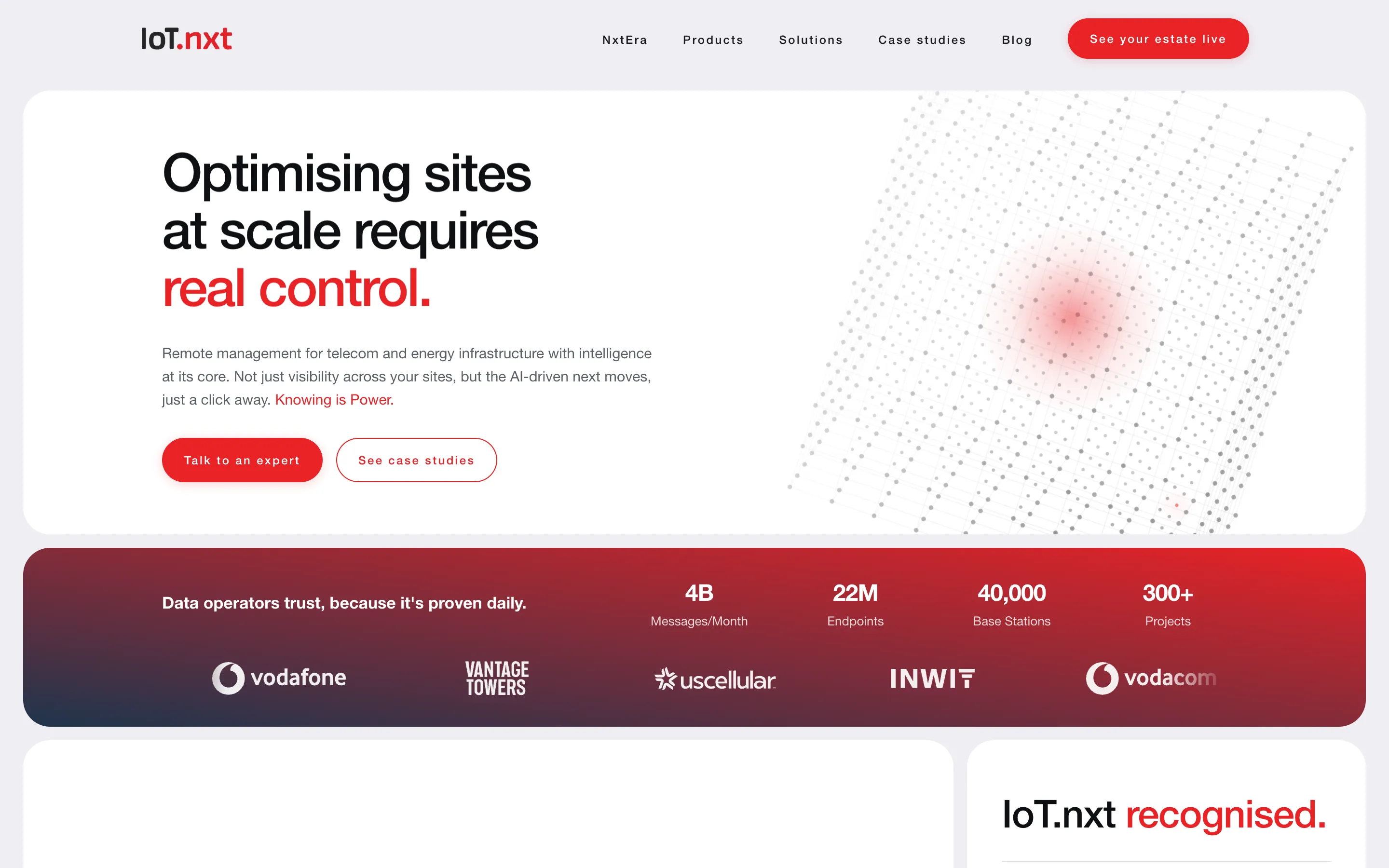
The homepage runs as an argument. A single hero claim, then the proof band that earns the right to make it: messages per month, endpoints, base stations, projects, and the logos of the operators who trust it. Then the two products, each on its own panel, then how the AI layer senses, reasons and acts across a site, then recognition, then one clear next step.
Nothing is placed for decoration. Every section either states a capability, proves one, or moves the reader toward a conversation with an expert.
The visual system
A near-white ground, one saturated red carried by the proof band, the product panels and the calls to action, and generous space around a tight type hierarchy. The red is the company's own; the restraint around it is what makes it read as premium rather than loud.
Type does the work. A single sans in a few weights, headlines that finish their sentence in colour, and body copy that stays short because the proof is doing the persuading.
The wheel
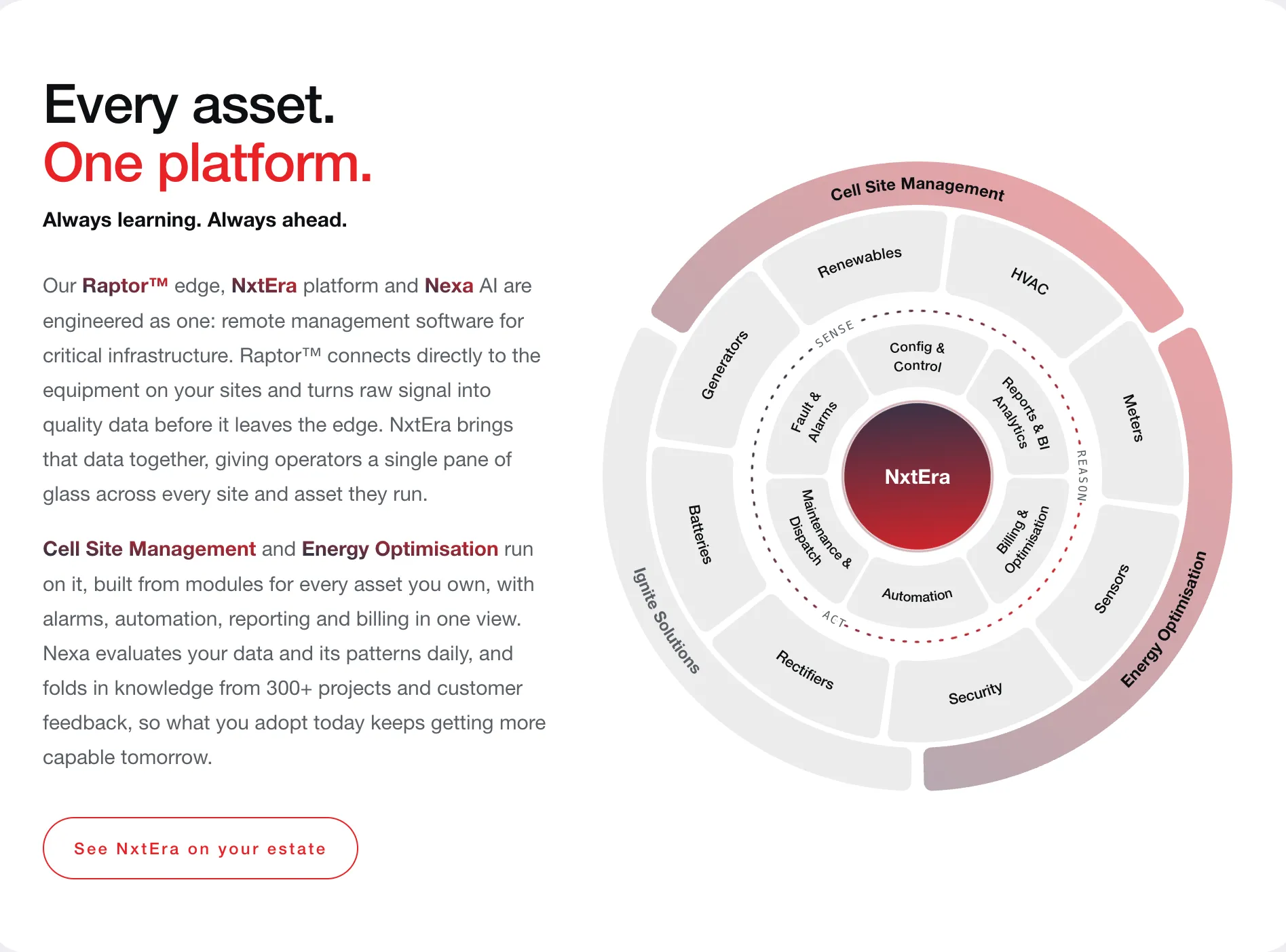
One interactive diagram carries both the information architecture and the way the company sells. NxtEra sits at the centre. Around it, the loop every module follows: sense, reason, act. The next ring is the modules themselves, config and control, fault and alarms, maintenance and dispatch, automation, billing and optimisation, reports and analytics. Outside that, the assets they run on: generators, batteries, rectifiers, meters, sensors, security, HVAC and renewables. And on the rim, the two offerings a customer actually buys, Cell Site Management and Energy Optimisation, with partner products alongside.
Hover a segment and the rest of the wheel explains its place. It replaced three pages of prose, and it is the same structure the platform's navigation follows, so a prospect learns the product's shape before they ever log in.
Designed as code
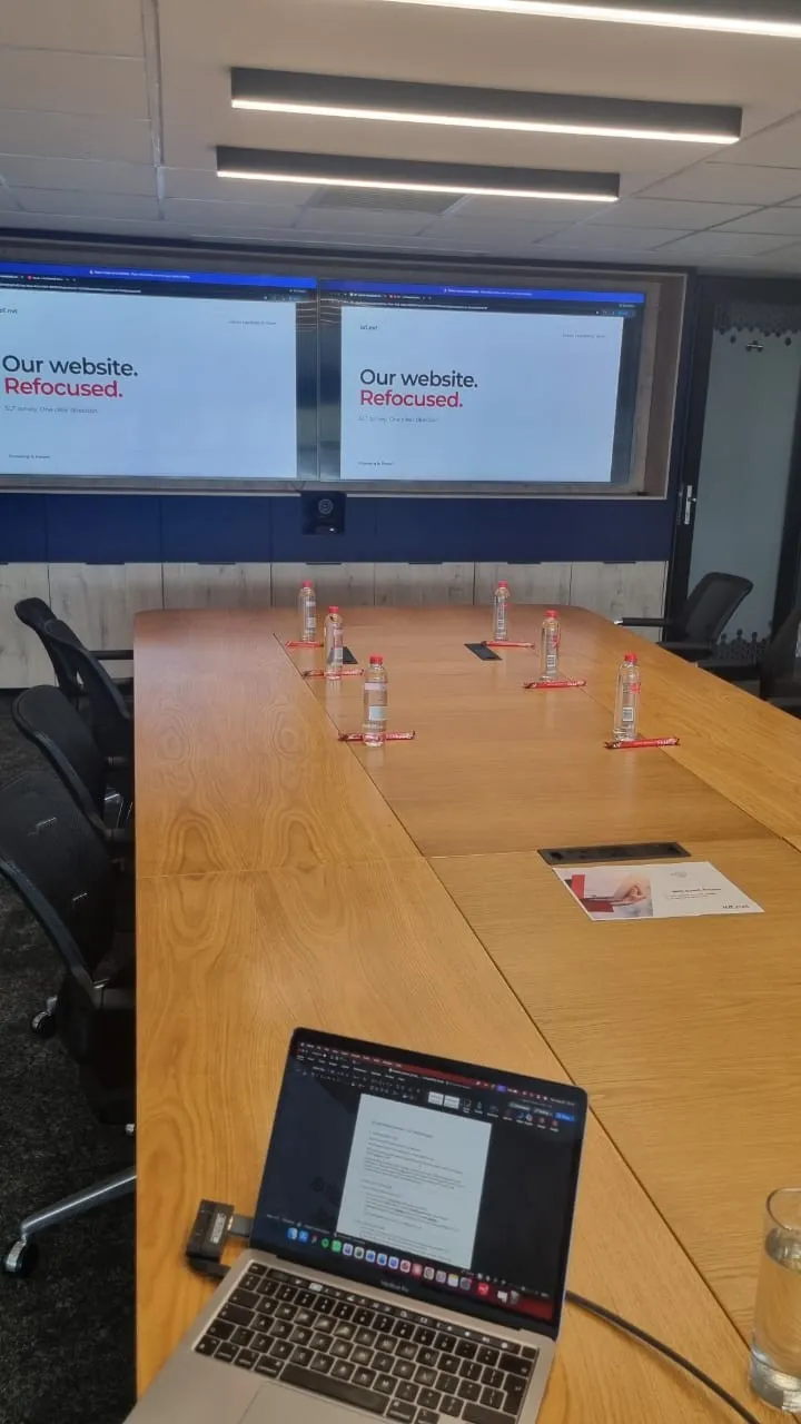
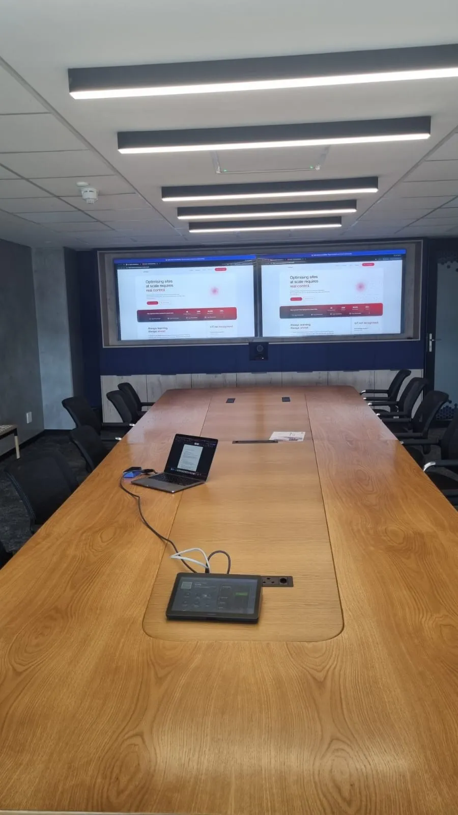
AI design tools each fit a stage. Early on you want the fastest thing a room can react to; later you want something that already looks like the product. This site was past the sketch stage from day one, so I designed and built it in Claude Code rather than drawing it in Figma and handing it over. Every direction was judged as a working page in a browser, at real widths, with real copy and real motion, which is a far more honest test than a static frame.
Because the design was code, the things a mockup cannot show were designed too. We optimised for SEO and for mobile in the build itself: semantic headings and metadata, fast first paint, and layouts that stack cleanly on a phone rather than being adapted afterwards.
It also changed what the company received. Not a handover document and a build estimate, but a site already standing up, now with the business for review.
What I would tell another designer
Get the brief into one sentence before you open a tool. For this site it was "product-led, proven, light", and every later argument about a section was settled by asking which of those three words it served.